GT Metabolic
GT Metabolic is a medtech startup focused on delivering a revolutionary approach to bariatric surgery. To stand out in a competitive field and promote their breakthrough tech, they needed a bold identity that could speak to both surgeons and patients.
Identity Design • Art Direction • Motion Design
THE CHALLENGE
With the rise of GLP-1s and a range of methods available to surgeons, GT Metabolic was dealing with a competitive space. Elevating the brand and getting a little bold was needed to help them stand out and get their message across.
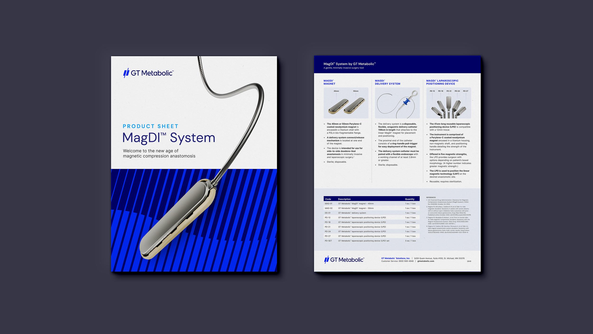
On top of that, this is a novel approach to bariatric surgery. Instead of intrusive cutting of the stomach or intestines, this surgery uses two magnets to create a side-to-side anastomosis, aiding in weight management and metabolic control. Selling a new method and technology to hospitals and enabling patients to understand this option wasn’t going to be easy. Success required clear and compelling communication to convey that this approach is less invasive, easier to adopt, and designed for lasting outcomes.
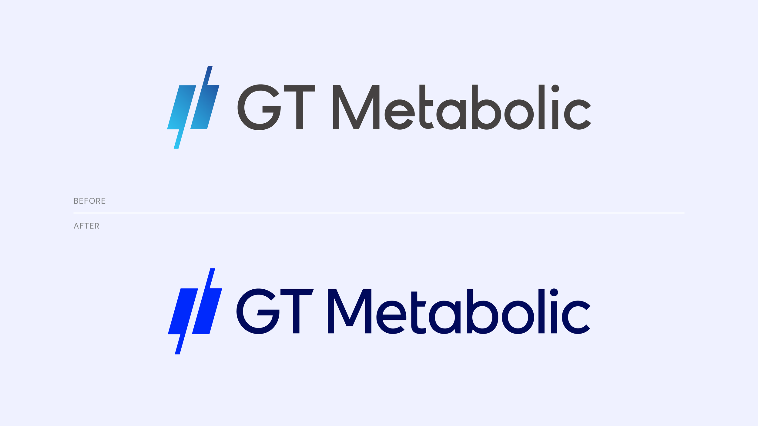
LOGO EVOLUTION
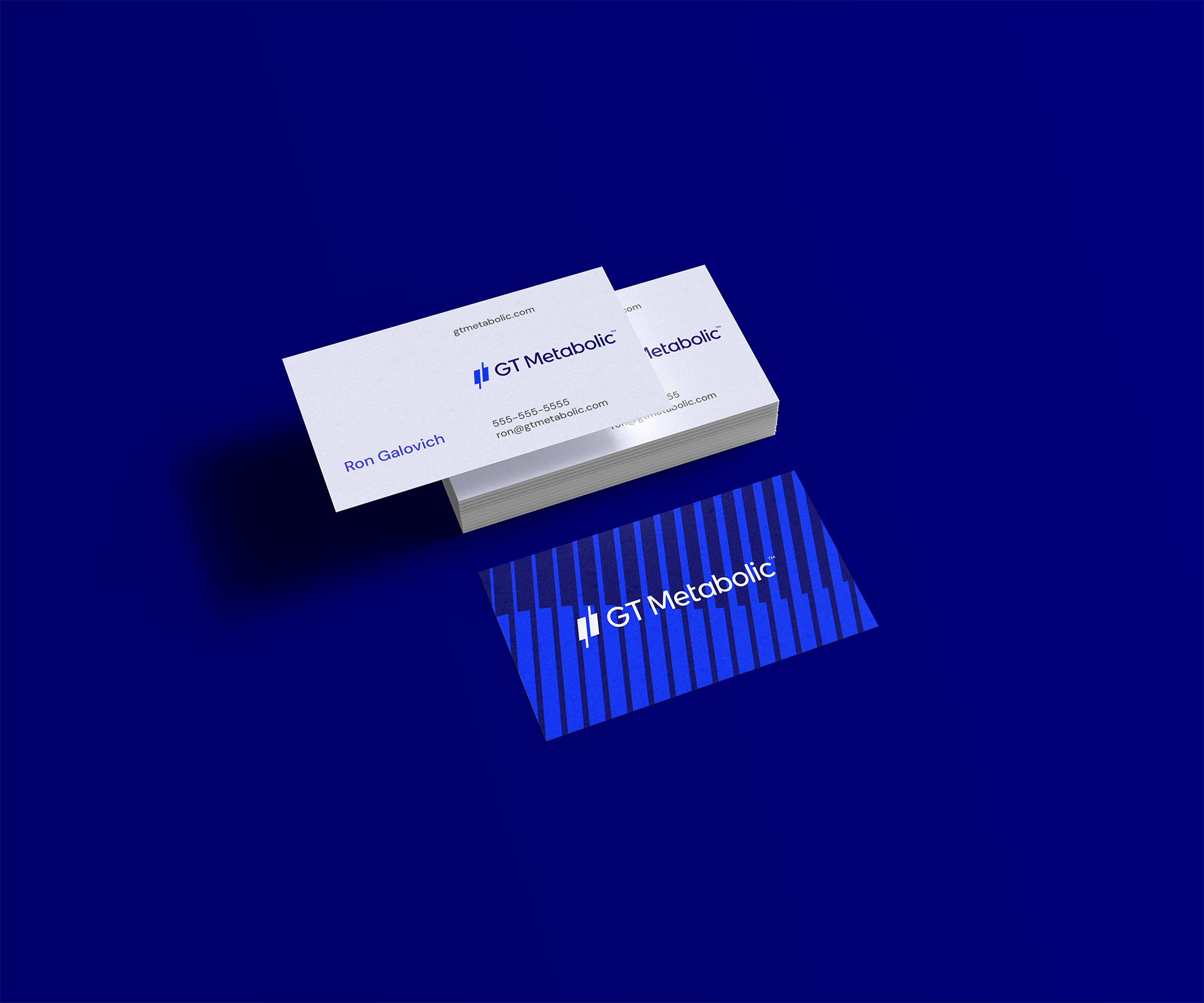
The first effort in bolstering the GT Metabolic identity was to evolve their logo. The existing logomark is an ownable symbol that quickly expressed the product in a contemporary space. The wordmark, however, seemed out of harmony and struggled at small scale. The solution was a custom wordmark that carried over characteristics from the logomark, increased the x-height and negative space for optimal legibility, and presents cleaner letterforms.
SHAPING THE IDENTITY
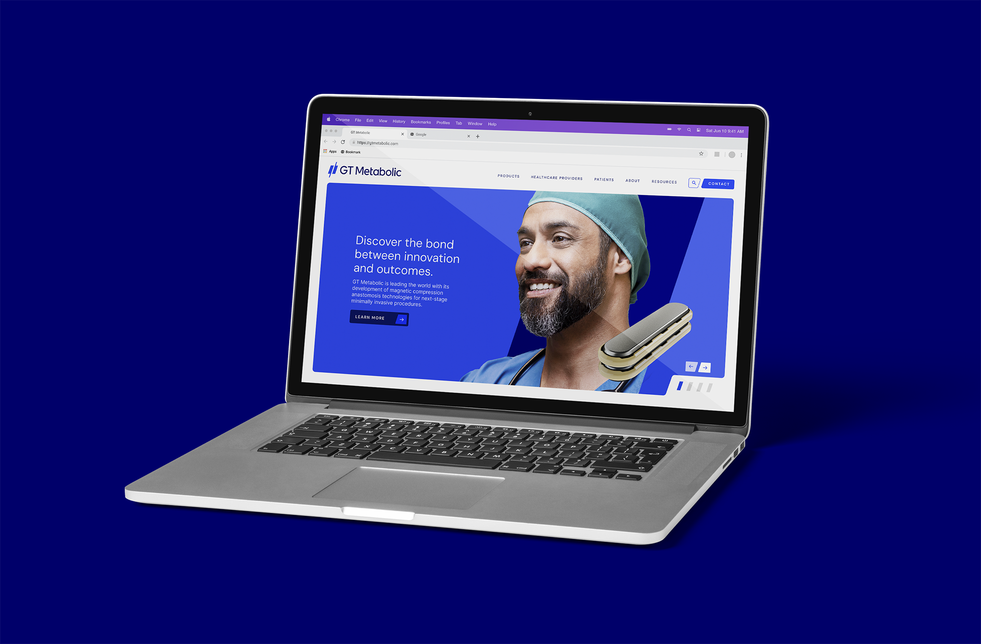
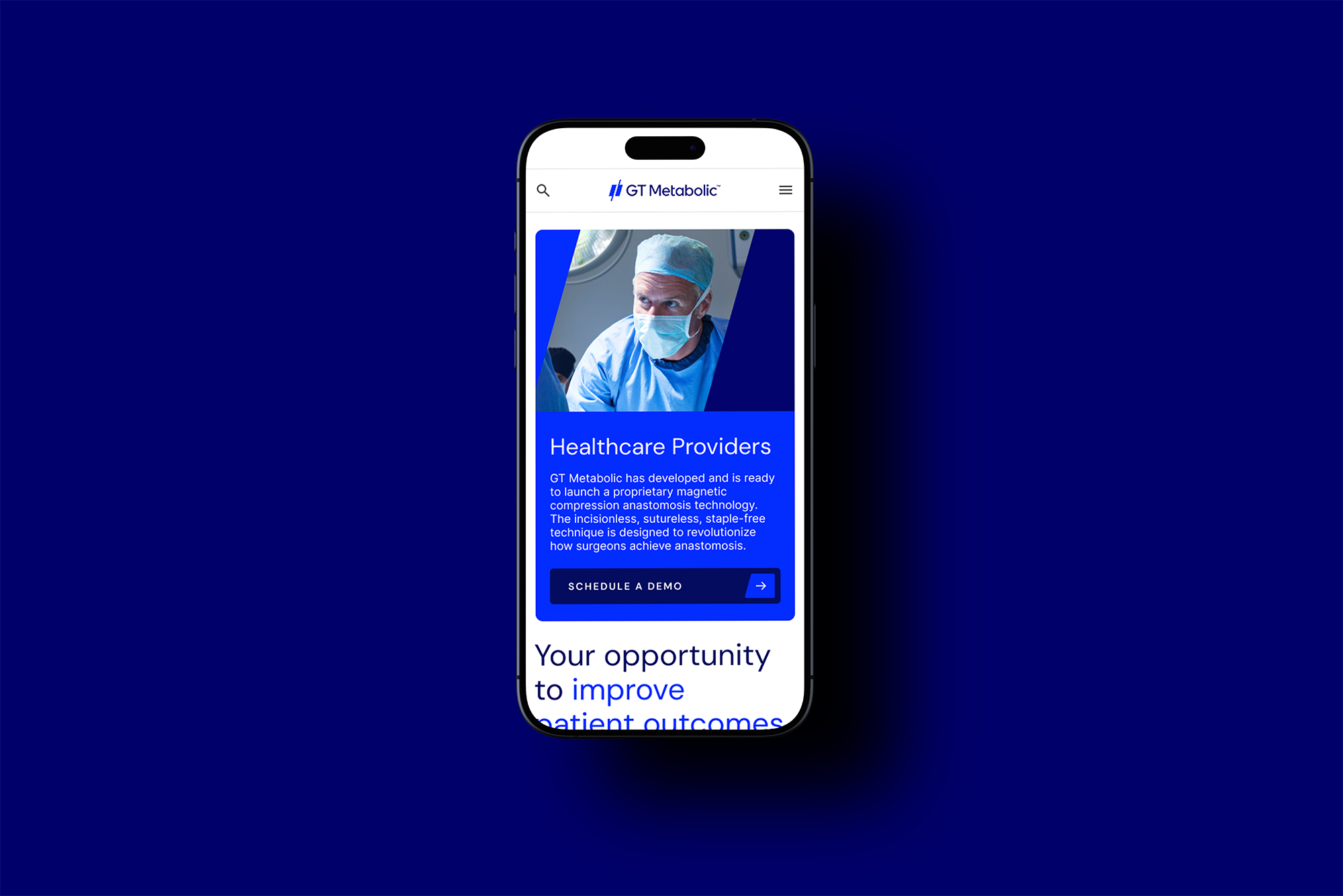
A simple-to-use, innovative, high-quality product. These key selling points are common in the B2C tech space. While GT Metabolic may sell to surgeons, communication cues from consumer technology culture can be a powerful way to resonate. Inspired by those tech brands, the identity was built around clean white space, elegant typography and a bold, restrained color palette.
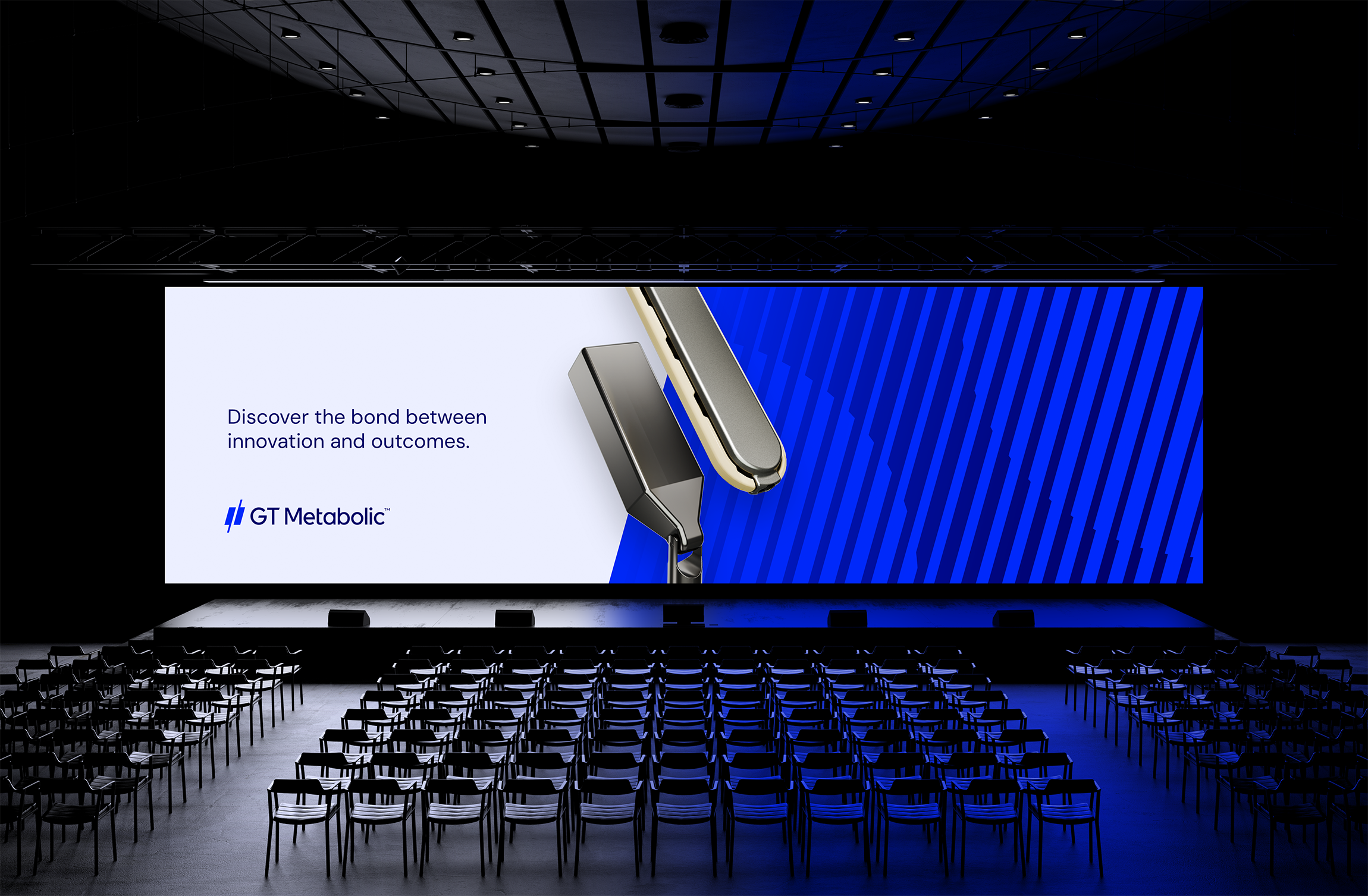
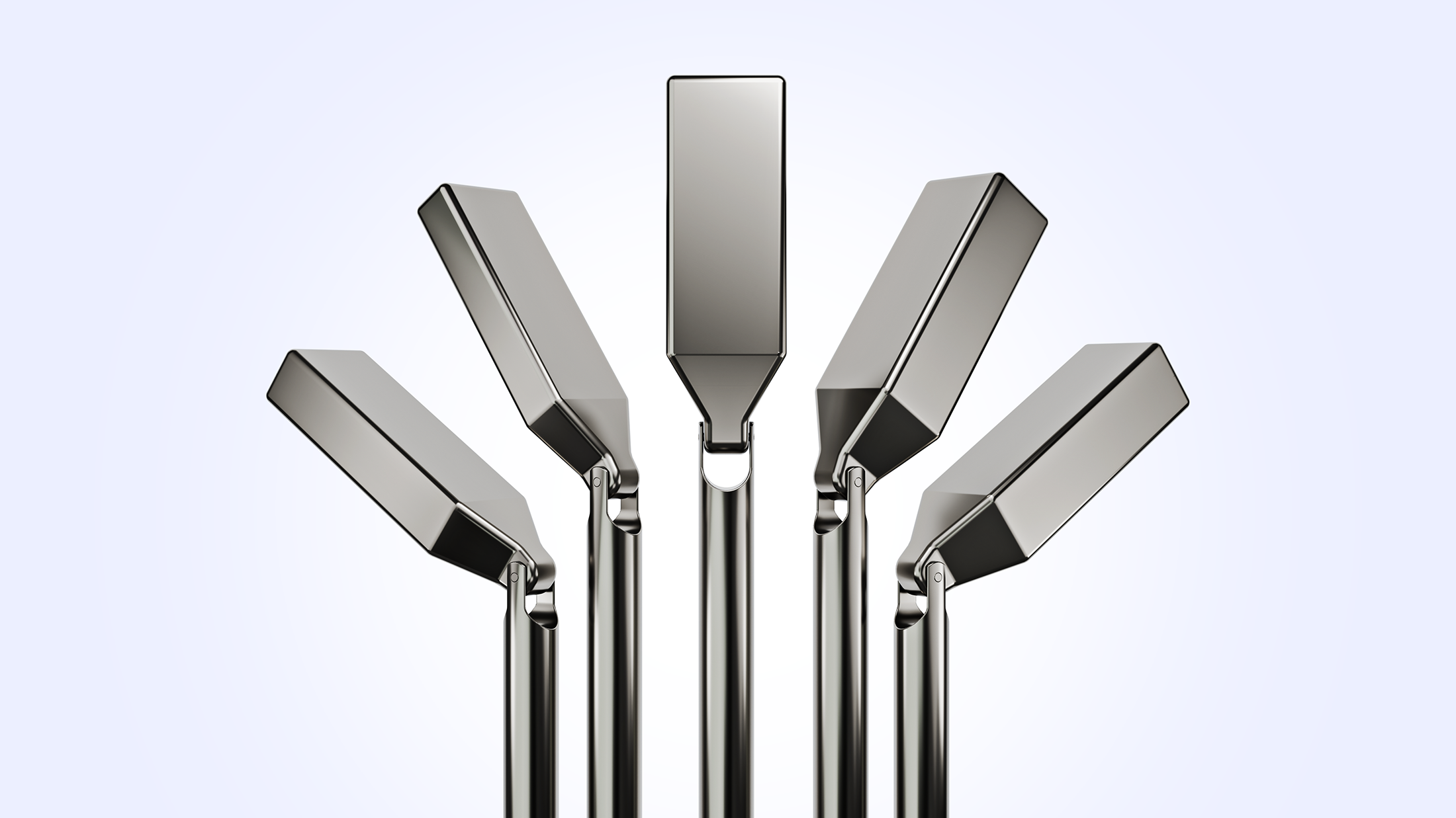
New 3D renders were created to demonstrate the simplicity and use of the products with heroic and considered compositions.
A new pattern mimics the logo mark, brings organic forms to the identity and is indicative to the patient journey with lines cascading in weight.
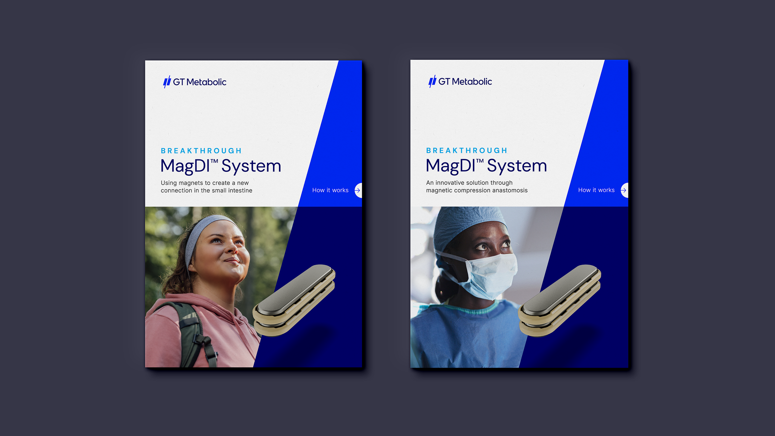
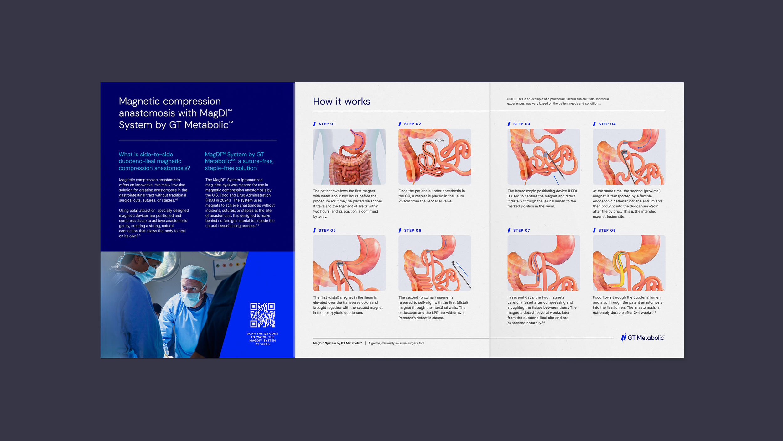
APPLYING THE LOOK
The identity was pressure tested through a range of applications. From “how it works” guides and product sheets to web design and social, the brand system proves to be flexible and scalable. This flexibility allows the brand to communicate clearly with surgeons in highly technical contexts, while remaining confident, modern, and recognizable across broader digital touchpoints.